


UNITED STATES COMPARED WITH OTHER COUNTRIES
Note: Some of the data in this article are old – but where this is the case, inequality has worsened since the data were produced.
Inequality and power
The United States is the archetypal free market nation. It has a powerful economy and military. But its economy is becoming depleted by financial crises and the levels of national debt, the result of an unbalanced economy caused by rampant consumerism and an overbearing finance sector.
Like other Free Market countries, the most notable factor is the uneven distribution of wealth and power – and the effects these have on the lives of the majority. A significant side-effect of rampant inequality is the fragmentation of society and the domination of the political process by a small and wealthy elite.
Although the writer of this article does not articulate it, the United States and some other Free Market countries are becoming Plutocracies; nations in which economic and political policies are dominated by the interests of the wealthy.
(Most of the material in this article is drawn from work by G. William Domhoff, research Professor at the University of California)Inequality and Power
This document presents details on the wealth and income distributions in the United States, and explains how we use these two distributions as power indicators.
First, though, some definitions. Generally speaking, wealth is the value of everything a person or family owns, minus any debts. However, for purposes of studying the wealth distribution, economists define wealth in terms of marketable assets, such as real estate, stocks, and bonds, leaving aside consumer durables like cars and household items because they are not as readily converted into cash and are more valuable to their owners for use purposes than they are for resale.. In addition, economists use the concept of financial wealth -- also referred to in this document as "non-home wealth" -- which is defined as net worth minus net equity in owner-occupied housing. As Wolff (2004, p. 5) explains, "Financial wealth is a more 'liquid' concept than marketable wealth, since one's home is difficult to convert into cash in the short term. It thus reflects the resources that may be immediately available for consumption or various forms of investments."
We also need to distinguish wealth from income. Income is what people earn from work, but also from dividends, interest, and any rents or royalties that are paid to them on properties they own. In theory, those who own a great deal of wealth may or may not have high incomes, depending on the returns they receive from their wealth, but in reality those at the very top of the wealth distribution usually have the most income. (But it's important to note that for the rich, most of that income does not come from "working": in 2008, only 19% of the income reported by the 13,480 individuals or families making over $10 million came from wages and salaries.
Exactly how rich are the Top 1%?
People often wonder exactly how much income and/or wealth someone needs to have to be included in the Top 1% or the Top 20%; Table 1 below lists some absolute dollar amounts associated with various income and wealth classes, but the important point to keep in mind is that for the most part, it's the relative positions of wealth holders and income earners that we are trying to comprehend in this document.
| Wealth or income class | Mean household income | Mean household net worth | Mean household financial (non-home) wealth |
|---|---|---|---|
| Top 1 percent | $1,318,200 | $16,439,400 | $15,171,600 |
| Top 20 percent | $226,200 | $2,061,600 | $1,719,800 |
| 60th-80th percentile | $72,000 | $216,900 | $100,700 |
| 40th-60th percentile | $41,700 | $61,000 | $12,200 |
| Bottom 40 percent | $17,300 | -$10,600 | -$14,800 |
From Wolff (2012); only mean figures are available, not medians. Note that income and wealth are separate measures; so, for example, the top 1% of income-earners is not exactly the same group of people as the top 1% of wealth-holders, although there is considerable overlap.
The Wealth Distribution
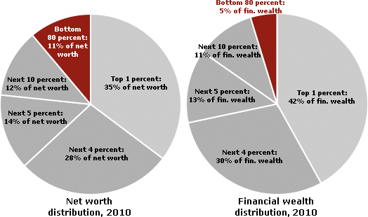
In the United States, wealth is highly concentrated in a relatively few hands. As of 2010, the top 1% of households (the upper class) owned 35.4% of all privately held wealth, and the next 19% (the managerial, professional, and small business stratum) had 53.5%, which means that just 20% of the people owned a remarkable 89%, leaving only 11% of the wealth for the bottom 80% (wage and salary workers). In terms of financial wealth (total net worth minus the value of one's home), the top 1% of households had an even greater share: 42.1%. Table 2 and Figure 1 present further details, drawn from the careful work of economist Edward N. Wolff at New York University (2012).
Do Americans know their country's wealth distribution?
A remarkable study (Norton & Ariely, 2010) reveals that Americans have no idea that the wealth distribution (defined for them in terms of "net worth") is as concentrated as it is. When shown three pie charts representing possible wealth distributions, 90% or more of the 5,522 respondents -- whatever their gender, age, income level, or party affiliation -- thought that the American wealth distribution most resembled one in which the top 20% has about 60% of the wealth. In fact, of course, the top 20% control about 85% of the wealth
Even more striking, they did not come close on the amount of wealth held by the bottom 40% of the population. It's a number I haven't even mentioned so far, and it's shocking: the lowest two quintiles hold just 0.3% of the wealth in the United States. Most people in the survey guessed the figure to be between 8% and 10%, and two dozen academic economists got it wrong too, by guessing about 2% -- seven times too high. Those surveyed did have it about right for what the 20% in the middle have; it's at the top and the bottom that they don't have any idea of what's going on.
Americans from all walks of life were also united in their vision of what the "ideal" wealth distribution would be, which may come as an even bigger surprise than their shared misinformation on the actual wealth distribution. They said that the ideal wealth distribution would be one in which the top 20% owned between 30 and 40 percent of the privately held wealth, which is a far cry from the 85 percent that the top 20% actually own. They also said that the bottom 40% -- that's 120 million Americans -- should have between 25% and 30%, not the mere 8% to 10% they thought this group had, and far above the 0.3% they actually had. In fact, there's no country in the world that has a wealth distribution close to what Americans think is ideal when it comes to fairness. So maybe Americans are much more egalitarian than most of them realize about each other, at least in principle and before the rat race begins.
The rest of the world
Thanks to a 2006 study by the World Institute for Development Economics Research -- using statistics for the year 2000 -- we now have information on the wealth distribution for the world as a whole, which can be compared to the United States and other well-off countries. The authors of the report admit that the quality of the information available on many countries is very spotty and probably off by several percentage points, but they compensate for this problem with very sophisticated statistical methods and the use of different sets of data. The only industrialized democracy with a higher concentration of wealth in the top 10% than the United States is Switzerland at 71.3%. For the figures for several other Northern European countries and Canada, all of which are based on high-quality data, see Table 5.
| wealth owned by top 10% | |
|---|---|
| Switzerland | 71.3% |
| United States | 69.8% |
| Denmark | 65.0% |
| France | 61.0% |
| Sweden | 58.6% |
| UK | 56.0% |
| Canada | 53.0% |
| Norway | 50.5% |
| Germany | 44.4% |
| Finland | 42.3% |
The Relationship between Wealth and Power
What's the relationship between wealth and power? To avoid confusion, let's be sure we understand they are two different issues. Wealth, as I've said, refers to the value of everything people own, minus what they owe, but the focus is on "marketable assets" for purposes of economic and power studies. Power has to do with the ability (or call it capacity) to realize wishes, or reach goals, which amounts to the same thing, even in the face of opposition (Russell, 1938; Wrong, 1995). Some definitions refine this point to say that power involves Person A or Group A affecting Person B or Group B "in a manner contrary to B's interests," which then necessitates a discussion of "interests," and quickly leads into the realm of philosophy (Lukes, 2005, p. 30). Leaving those discussions for the philosophers, at least for now, how do the concepts of wealth and power relate?
First, wealth can be seen as a "resource" that is very useful in exercising power. That's obvious when we think of donations to political parties, payments to lobbyists, and grants to experts who are employed to think up new policies beneficial to the wealthy. Wealth also can be useful in shaping the general social environment to the benefit of the wealthy, whether through hiring public relations firms or donating money for universities, museums, music halls, and art galleries.
Second, certain kinds of wealth, such as stock ownership, can be used to control corporations, which of course have a major impact on how the society functions. Tables 6a and 6b show what the distribution of stock ownership looks like. Note how the top one percent's share of stock equity increased (and the bottom 80 percent's share decreased) between 2001 and 2010.
| Percent of all stock owned: | ||||
|---|---|---|---|---|
| Wealth class | 2001 | 2004 | 2007 | 2010 |
| Top 1% | 33.5% | 36.7% | 38.3% | 35.0% |
| Next 19% | 55.8% | 53.9% | 52.8% | 56.6% |
| Bottom 80% | 10.7% | 9.4% | 8.9% | 8.4% |
Income Inequality
Income and Power
The rising concentration of income can be seen in a special New York Times analysis by David Cay Johnston of an Internal Revenue Service report on income in 2004. Although overall income had grown by 27% since 1979, 33% of the gains went to the top 1%. Meanwhile, the bottom 60% were making less: about 95 cents for each dollar they made in 1979. The next 20% - those between the 60th and 80th rungs of the income ladder -- made $1.02 for each dollar they earned in 1979. Furthermore, Johnston concludes that only the top 5% made significant gains ($1.53 for each 1979 dollar). Most amazing of all, the top 0.1% -- that's one-tenth of one percent -- had more combined pre-tax income than the poorest 120 million people (Johnston, 2006).
But the increase in what is going to the few at the top did not level off, even with all that. As of 2007, income inequality in the United States was at an all-time high for the past 95 years, with the top 0.01% -- that's one-hundredth of one percent -- receiving 6% of all U.S. wages, which is double what it was for that tiny slice in 2000; the top 10% received 49.7%, the highest since 1917 (Saez, 2009 Income inequality in other countries
The degree of income inequality in the United States can be compared to that in other countries on the basis of the Gini coefficient, a mathematical ratio that allows economists to put all countries on a scale with values that range (hypothetically) from zero (everyone in the country has the same income) to 100 (one person in the country has all the income). On this widely used measure, the United States ends up 95th out of the 134 countries that have been studied -- that is, only 39 of the 134 countries have worse income inequality. The U.S. has a Gini index of 45.0; Sweden is the lowest with 23.0, and South Africa is near the top with 65.0.
The table that follows displays the scores for 22 major countries, along with their ranking in the longer list of 134 countries that were studied (most of the other countries are very small and/or very poor). In examining this table, remember that it does not measure the same thing as Table 5 earlier in this document, which was about the wealth distribution. Here we are looking at the income distribution, so the two tables won't match up as far as rankings. That's because a country can have a highly concentrated wealth distribution and still have a more equal distribution of income due to high taxes on top income earners and/or high minimum wages -- both Switzerland and Sweden follow this pattern. So one thing that's distinctive about the U.S. compared to other industrialized democracies is that both its wealth and income distributions are highly concentrated.
| Rank | Country | Gini Coefficient |
|---|---|---|
| 1. | Sweden | 23.0 |
| 2. | Norway | 25.0 |
| 8. | Austria | 26.0 |
| 10. | Germany | 27.0 |
| 17. | Denmark | 29.0 |
| 25. | Australia | 30.5 |
| 34. | Italy | 32.0 |
| 35. | Canada | 32.1 |
| 37. | France | 32.7 |
| 42. | Switzerland | 33.7 |
| 43. | United Kingdom | 34.0 |
| 45. | Egypt | 34.4 |
| 56. | India | 36.8 |
| 61. | Japan | 38.1 |
| 68. | Israel | 39.2 |
| 81. | China | 41.5 |
| 82. | Russia | 42.3 |
| 90. | Iran | 44.5 |
| 93. | United States | 45.0 |
| 107. | Mexico | 48.2 |
| 125. | Brazil | 56.7 |
| 133. | South Africa | 65.0 |
Note: These figures reflect family/household income, not individual income.
Source: Central Intelligence Agency (2010).
The differences in income inequality between countries also can be illustrated by looking at the share of income earned by the now-familiar Top 1% versus the Bottom 99%. One of the most striking contrasts is between Sweden and the United States from 1950 to 2009, as seen in Figure 8; and note that the differences between the two countries narrowed in the 1950s and 1960s, but after that went their separate ways, in rather dramatic fashion.
Income Ratios and Power: Executives vs. Average Workers
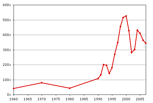
Another way that income can be used as a power indicator is by comparing average CEO annual pay to average factory worker pay, something that has been done for many years by Business Week and, later, the Associated Press. The ratio of CEO pay to factory worker pay rose from 42:1 in 1960 to as high as 531:1 in 2000, at the height of the stock market bubble, when CEOs were cashing in big stock options. It was at 411:1 in 2005 and 344:1 in 2007, according to research by United for a Fair Economy. By way of comparison, the same ratio is about 25:1 in Europe. The changes in the American ratio from 1960 to 2007 are displayed in Figure 9, which is based on data from several hundred of the largest corporations.
Source: Executive Excess 2008, the 15th Annual CEO Compensation Survey from the Institute for Policy Studies and United for a Fair Economy.
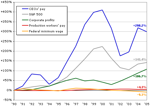
It's even more revealing to compare the actual rates of increase of the salaries of CEOs and ordinary workers; from 1990 to 2005, CEOs' pay increased almost 300% (adjusted for inflation), while production workers gained a scant 4.3%. The purchasing power of the federal minimum wage actually declined by 9.3%, when inflation is taken into account. These startling results are illustrated in Figur
Update to 2016: The average U.S. worker has seen wages climb slowly over the past year. The average big-company chief executive has seen compensation jump far more substantially.
CEOs at the nation’s largest publicly traded companies received 373 times the compensation of the average production and nonsupervisory worker last year
The differences in income inequality between countries also can be illustrated by looking at the share of income earned by the now-familiar Top 1% versus the Bottom 99%. One of the most striking contrasts is between Sweden and the United States from 1950 to 2009, as seen in Figure 8; and note that the differences between the two countries narrowed in the 1950s and 1960s, but after that went their separate ways, in rather dramatic fashion.
And the rate of increase is even higher for the very richest of the rich: the top 400 income earners in the United States. According to another analysis by Johnston (2010a), the average income of the top 400 tripled during the Clinton Administration and doubled during the first seven years of the Bush Administration. So by 2007, the top 400 averaged $344.8 million per person, up 31% from an average of $263.3 million just one year earlier").
How are these huge gains possible for the top 400? It's due to cuts in the tax rates on capital gains and dividends, which were down to a mere 15% in 2007 thanks to the tax cuts proposed by the Bush Administration and passed by Congress in 2003. Since almost 75% of the income for the top 400 comes from capital gains and dividends, it's not hard to see why tax cuts on income sources available to only a tiny percent of Americans mattered greatly for the high-earning few. Overall, the effective tax rate on high incomes fell by 7% during the Clinton presidency and 6% in the Bush era, so the top 400 had a tax rate of 20% or less in 2007, far lower than the marginal tax rate of 35% that the highest income earners (over $372,650) supposedly pay. It's also worth noting that only the first $106,800 of a person's income is taxed for Social Security purposes (as of 2010), so it would clearly be a boon to the Social Security Fund if everyone -- not just those making less than $106,800 -- paid the Social Security tax on their full incomes.
Source: Executive Excess 2006, the 13th Annual CEO Compensation Survey from the Institute for Policy Studies and United for a Fair Economy.
Source: Alvaredo et al. (2012), World Top Incomes Database.
Although some of the information I've relied upon to create this section on executives' vs. workers' pay is a few years old now, the AFL/CIO provides up-to-date information on CEO salaries. There, you can learn that the median compensation for CEO's in all industries as of early 2010 is $3.9 million; it's $10.6 million for the companies listed in Standard and Poor's 500, and $19.8 million for the companies listed in the Dow-Jones Industrial Average. Since the median worker's pay is about $36,000, then you can quickly calculate that CEOs in general make 100 times as much as the workers, that CEO's of S&P 500 firms make almost 300 times as much, and that CEOs at the Dow-Jones companies make 550 times as much. (For a more recent update on CEOs' pay, see "The Drought Is Over (At Least for CEOs)" at NYTimes.com; the article reports that the median compensation for CEOs at 200 major companies was $9.6 million in 2010 -- up by about 12% over 2009 and generally equal to or surpassing pre-recession levels.